Dolly
Cartography meets Typography
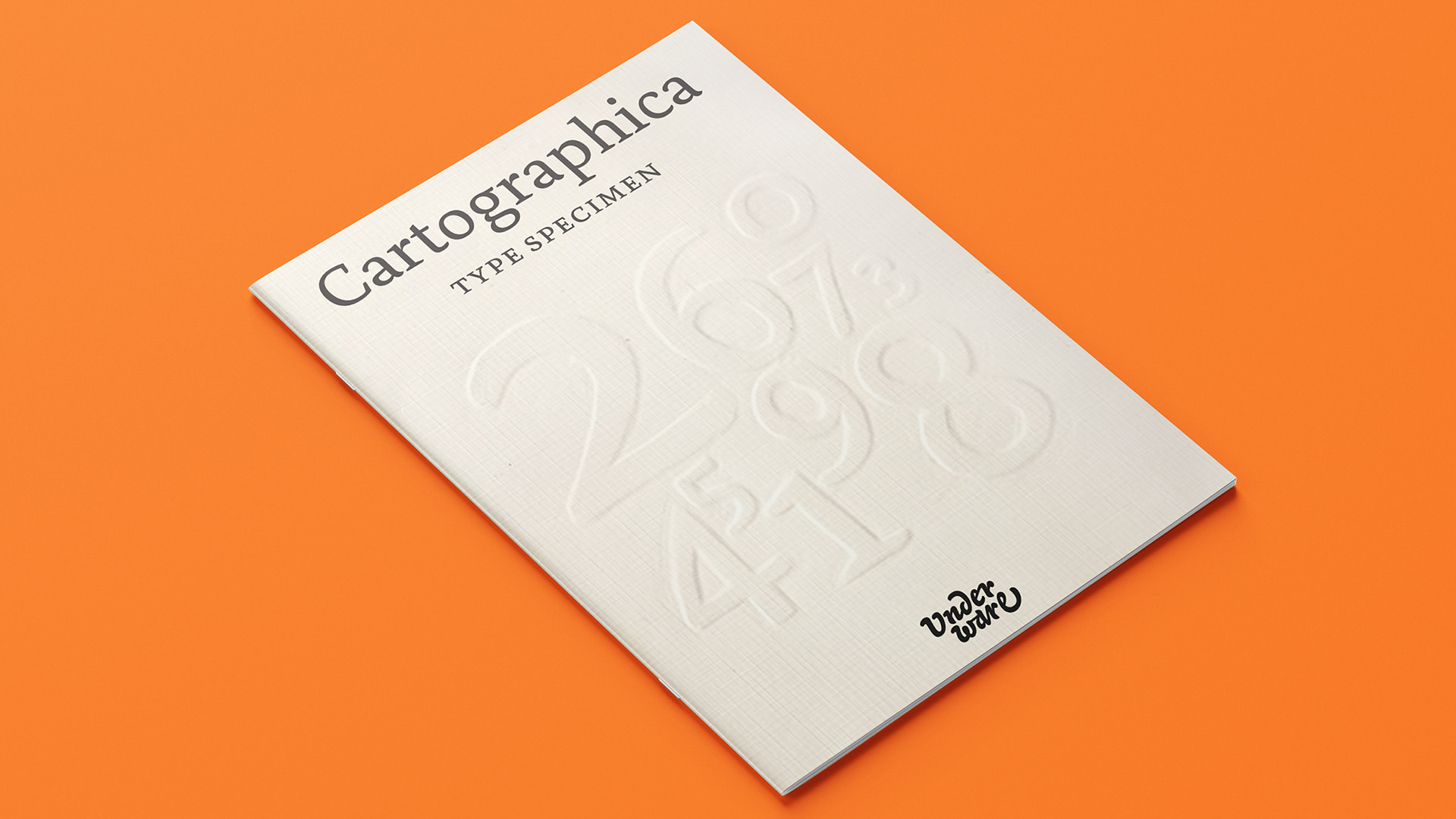
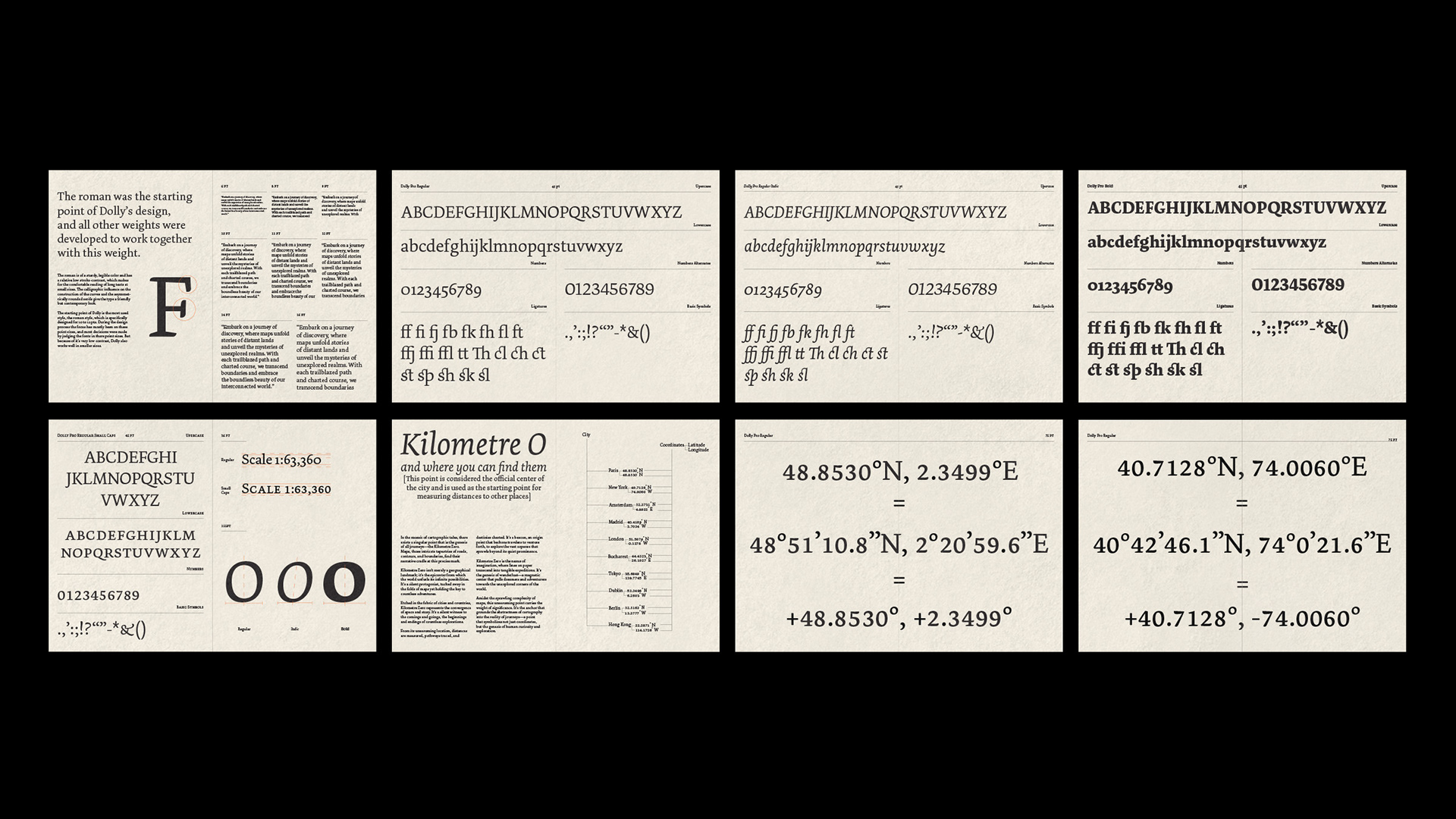
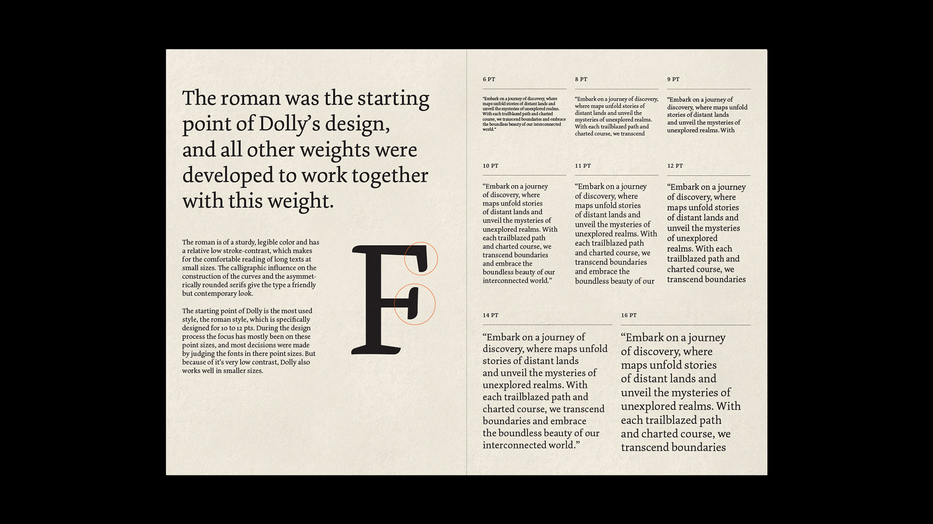
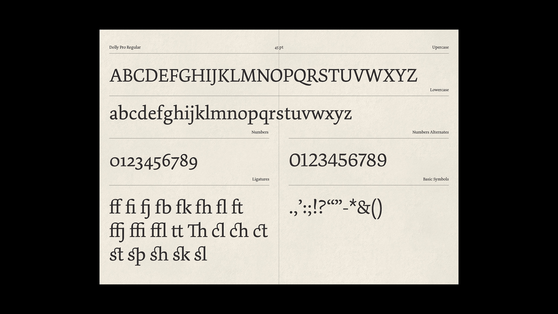
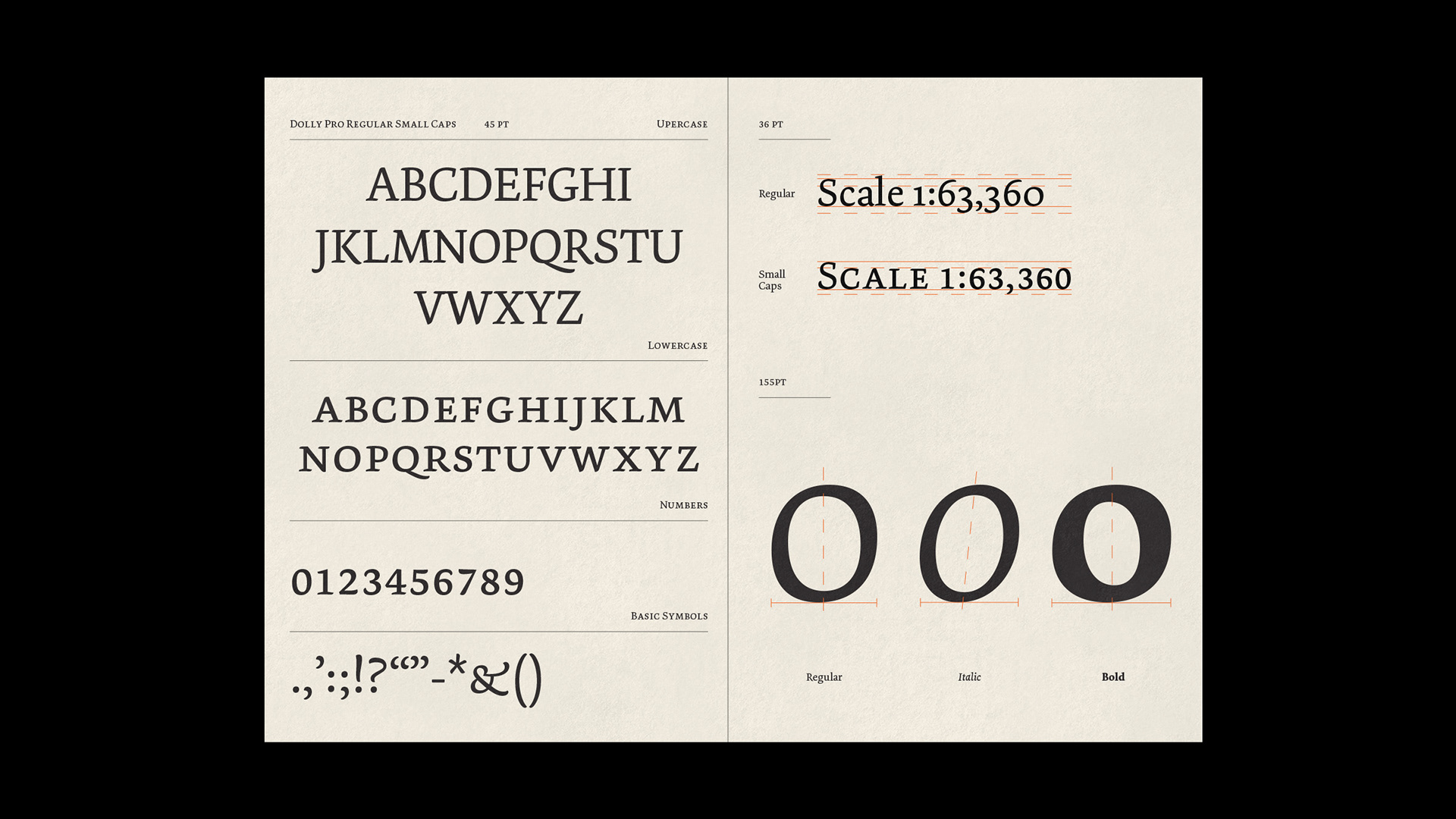
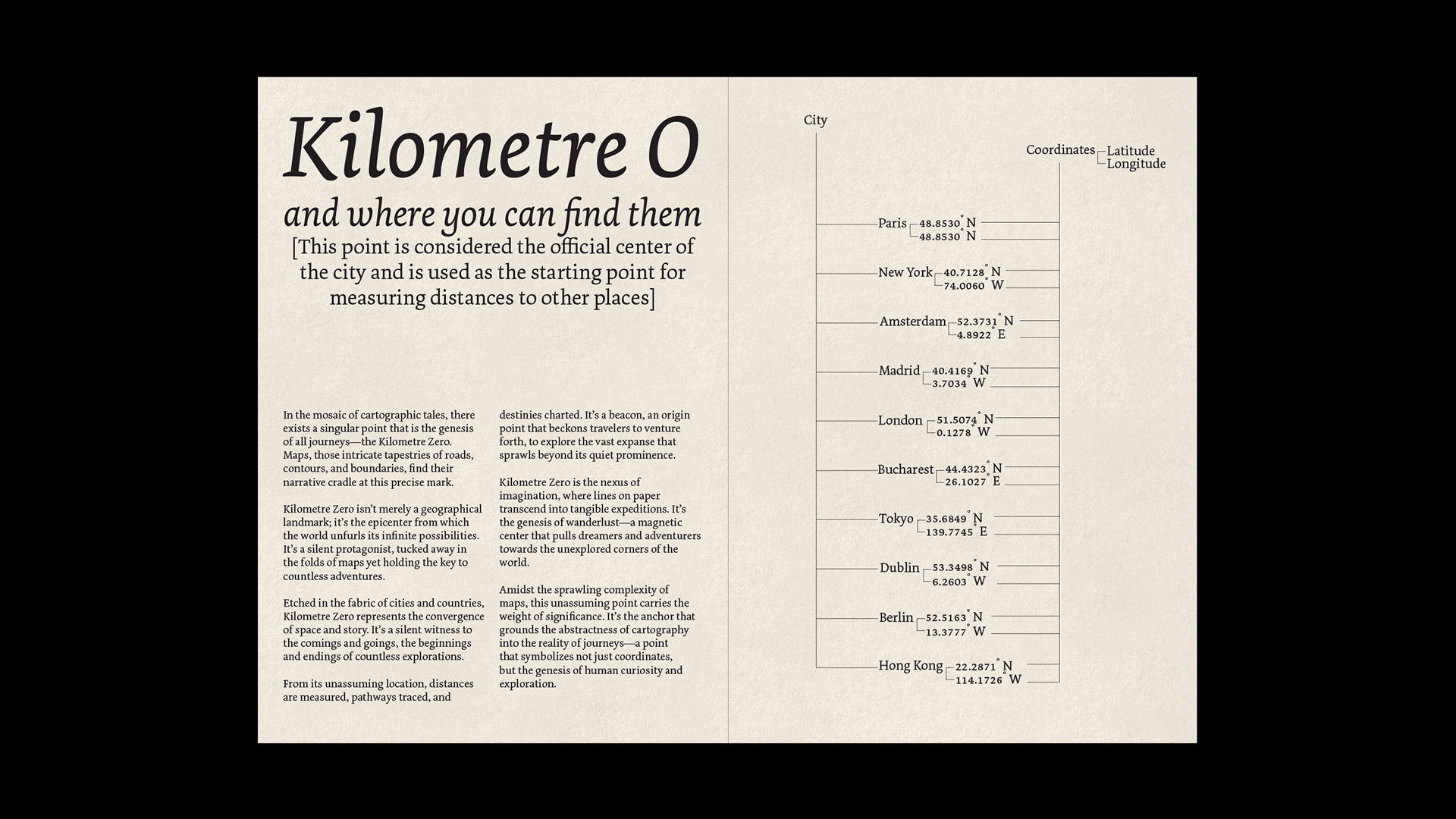
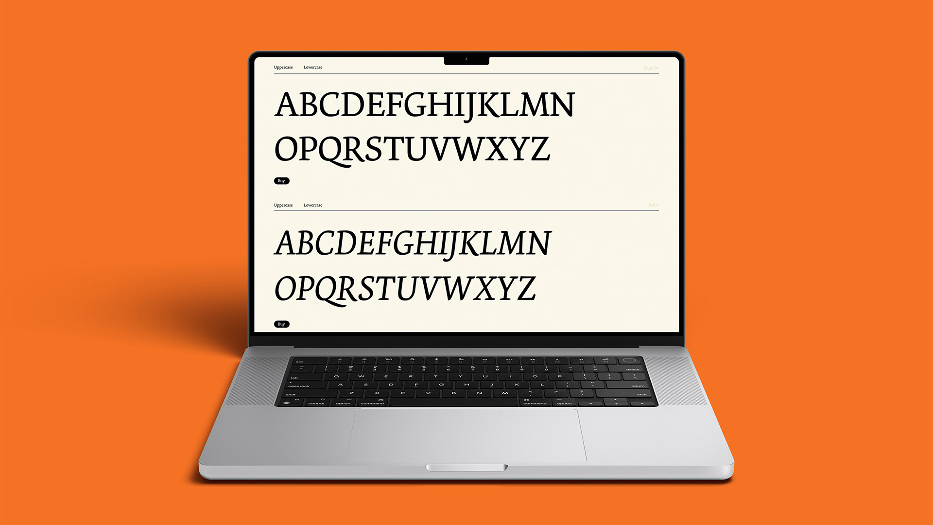
I created a promotional campaign for Underware Type Foundry Dolly Pro. This included a booklet, a mini-site, and a motion graphic, each element showcasing Dolly Pro’s adaptability in design. I explored the theme of maps, inspired by Dolly Pro’s origins in long-form text, including cartographic use. Centering on Kilometer 0, I highlighted the tabular lining numerals of Dolly Pro Small Caps—a variant well-suited for numerical clarity in mapping. My approach captures both the font’s historical use and its modern utility, connecting precision in cartography with typographic beauty.
